
Design Fundamentals: Color Palettes
The overall aesthetic of your website comes from your brand strategy. And brand strategy comes largely from understanding your ideal client, what they want and need, and how you fill that gap.
Understanding your ideal client is a big part of your business and if you haven’t worked through that yet, Sealevel suggests checking this blog post and podcast episode from Amy Porterfield blog to learn about finding your ideal client.
Once you’ve figured that out, it’s time to jump into how that translates into the design of your site and choosing your color palettes.
Sealevel strongly suggests using no more than three colors. Sometimes one or two more colors and can work but in most cases, it’s best to know that in design less is more.
It’s easy to clog your site with tons of design elements but simplicity is much better for web.
Here’s how you can choose your colors:
Use a photo
Allison came up with the idea for Sealevel while train traveling across Austria. But funny enough, she used a photo from trekking in the jungle of northern Laos for Sealevel’s color palette.

We pulled the red, yellow, and blue that we use through out the site from this photo that Allison took on the top of a mountain in the jungle of Northern Laos. The sunrise/sunset red and yellow as well as the blue from the sky or ocean is in most of Allison’s travel photos and it defined the aesthetic of Sealevel Agency.


2. There’s nothing wrong with black and white.
Remember, Less is More. There’s nothing wrong with using black and white. Grayscale and black and white elements can be an extremely bold design choice and allows you to focus on usability, which the primary function of your website.
If you want to make a statement with black and white design, you can also add a single accent color to bring in the users focus where and when you need it most. A single accent color on an otherwise black and white website can bring the viewer to exactly on the page you want them to go, without blinking arrows and overly “salesy” copy.
Especially if you’re not sure where your brand is going and aren’t ready to commit to one color palette, starting with grayscale is a great place to start.
3. Use the color wheel
– Monochromatic color scheme: different shades of the same color.

Analogous color scheme: colors next to each other on the color wheel.
Complementary color scheme: colors on opposite sides of the wheel.
– Triadic color scheme: colors in three corners of the color wheel.


4. Use color theory to capture a “mood”.
What colors mean:
red: energy, power, passion
orange: joy, enthusiasm, creativity
yellow: happiness, intellect, energy
green: ambition, growth, freshness, safety
blue:tranquility, confidence, intelligence
purple: luxury, ambition, creativity
black: power, elegance, mystery
white: cleanliness, purity, perfection
source: invisionapp.com/
Color theory can help you choose where to focus when you’re looking for a color scheme. This can help you capture the mood your site and brand is wants to evoke.
Do you want to protray confidence and intellect? Tranquility and joy? Your colors can help to determine the way your ideal customer is viewing your site and your brand
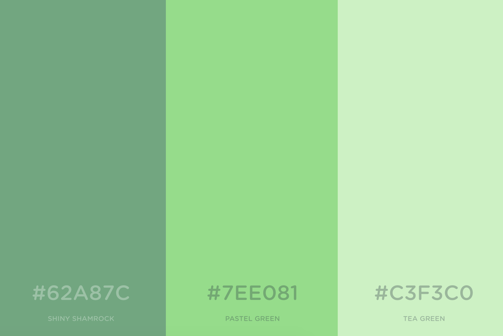
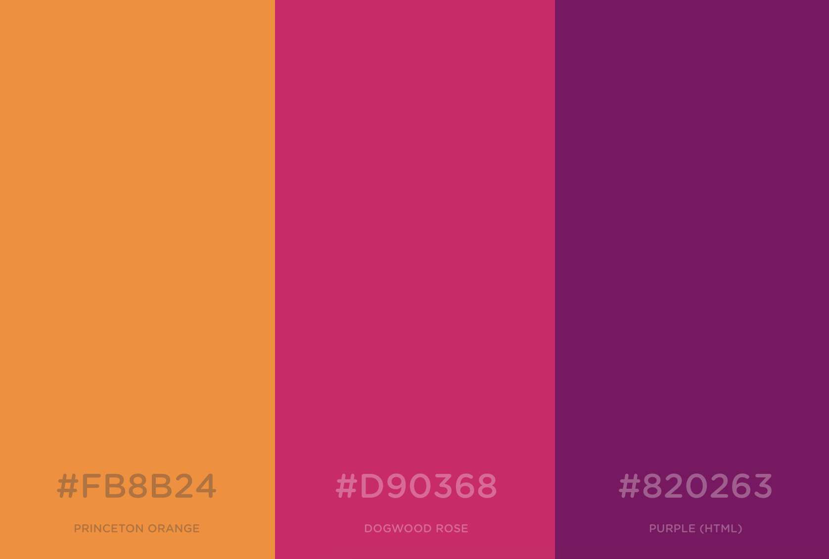
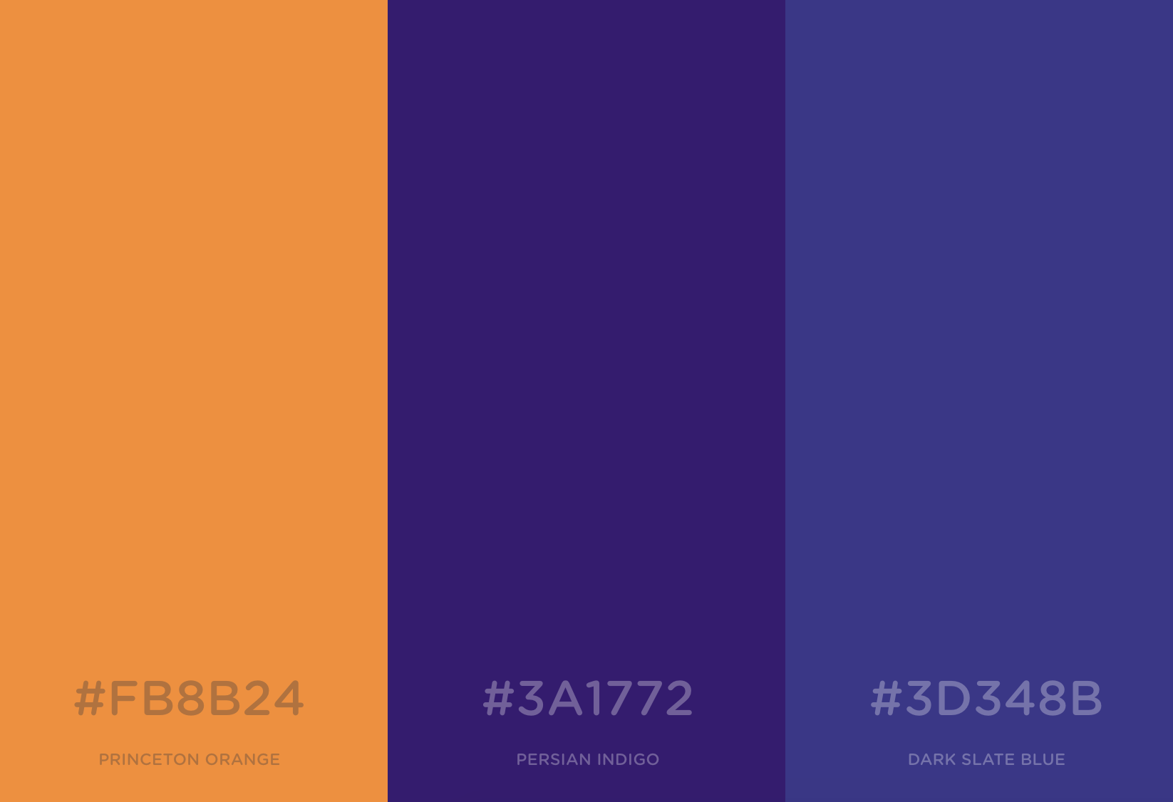
5. Use coolors.co/app to shift through colors and find hex codes.
Simply click your space bar to rotate through color palettes in coolors. You can click on the lock icon to lock a color into place while you continue to shift through more colors.

The 6-digit code after the # is called a hexadecimal or hex code. Once you choose your colors, you simply enter the hex code into Squarespace’s style editor.
#50a8aa (at the bottom) displays Sealevel’s blue:

